consistency + simplicity

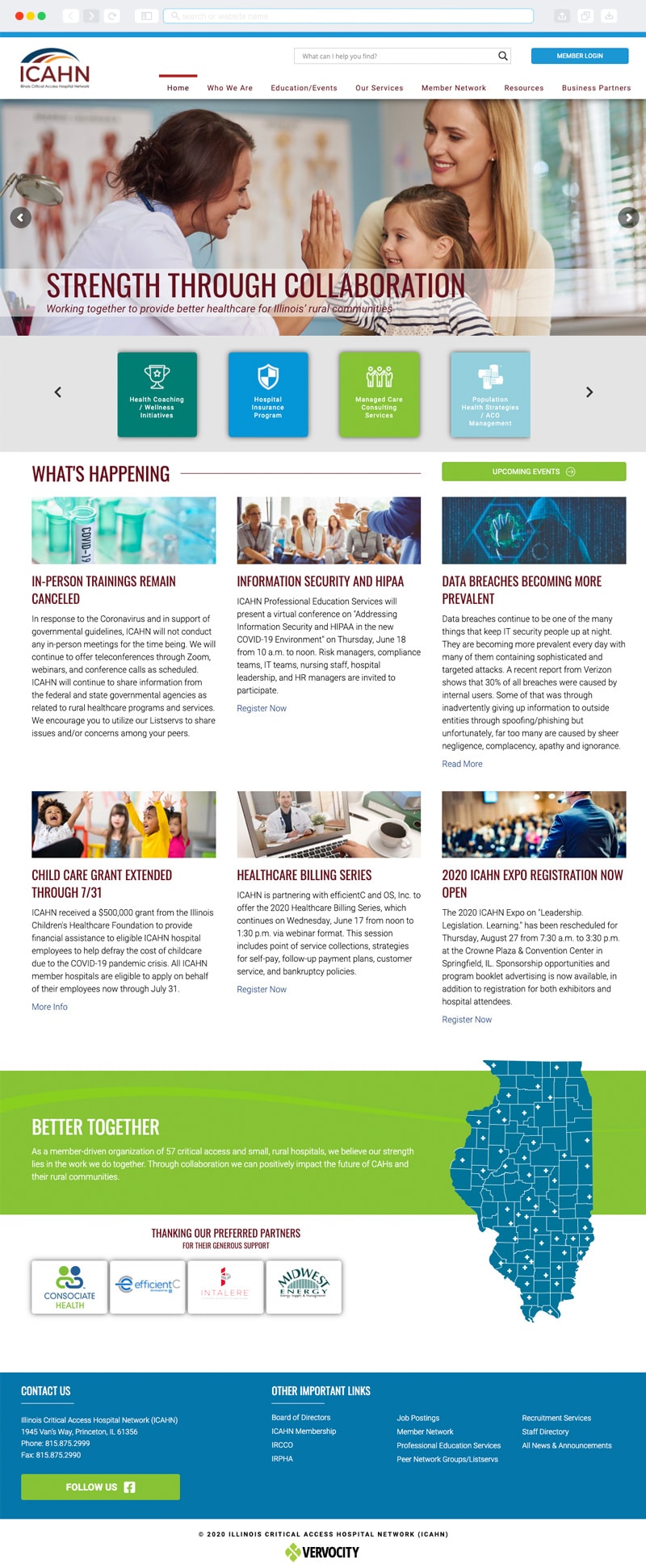
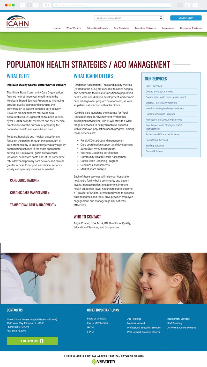
Vervocity was proud to partner with ICAHN for their new website project. It’s a modern design where we were able to use the logo and elements of the logo to reflect the organization throughout the website. You’ll see the featured colors used in elements of text and pops of color throughout the website. Featured images convey the voice of Illinois Critical Access Hospital Network and draw the eye down the page. The website has an intuitive design and navigation where we designed elements around consistency, simplicity, and clean interaction. We put ourselves in the user’s position to inform our design. This also means that the website is easy to update and maintain.
CLIENT TESTIMONIAL
Vervocity has been innovative and incredibly responsive. Just because something hasn’t been done before doesn’t deter this group and when you need help, no matter how small of a question or how large of a project, I’ve never had to wait more than an hour to hear back or have the problem fixed completely.
-- Stephanie Demay, Communications and Media Specialist
event registration
A big part of this project featured online event registration. We created a positive interactive experience for ICAHN’s audience in order to get more responses. These are conversational forms designed for human interaction. The online member portal is also set up for ease of use. The member portal is a powerful tool that adds even more functionality to this site. This interactive and dynamic dashboard provides users with all of the data they need to manage their professional information. Lastly, the website is easy to update via the content management system. We anticipated that the website would expand and change in the future and designed it accordingly.
Details
CLIENT
location
Princeton, IL
Services

