Brand Identity
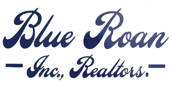
Established in 2005, Blue Roan Inc. Realtors is a local broker-owned company specializing in residential property management. They take pride in developing personal relationships with clients while offering quality, affordable housing. The one issue they faced is that they knew they could do better with their logo. They had an existing logo that was perhaps a bit too casual; the lines of text were curvy, bubbly, and difficult to read. At Vervocity, we understand that logo iconography is the centerpiece of a business’ brand. We wanted to lay down a foundation for a strong brand identity for Blue Roan Inc. Realtors. We also knew that an icon logo could pack more punch than just the business name alone, so we went to work developing something more modern and meaningful.
Effective Design
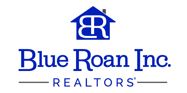
A visual element must be simple and to the point. It must speak the same language as the audience and bring the brand closer to its potential customers. Popular designs and trends are constantly changing, and companies that want to make the biggest impact need a modern and professional logo. What do we mean by modern though? A modern logo has clean lines, a minimalist design, and eye-catching colors. In other words, it’s a simple but effective design. We changed the Blue Roan logo to a serif font in the brand’s deep blue color. We also added imagery of a house to convey the industry Blue Roan is involved in. This new simplified logo cuts through all of the noise and distractions, making people sit up and take notice. You’ll be able to place this as a realtor right away, too. Before designing a logo, Vervocity thinks about what the business’ edge is and we run with it for your best ROI.

Want To See More?
Click the button below to see the other projects we have created for Blue Roan Inc., Realtors.


