Big red apples look delicious, but did you know the color red can also express urgency and other emotions? That’s because color is a powerful and effective mode of communication.
Colors influence mood, behavior, and even emotions; in turn, affecting branding and marketing. Graphic designers carefully use colors so that design has a purpose. But how do you know which colors to use in your own product branding and marketing decisions?
A little bit of color theory can go a long way in your design journey! We’ll explain color theory and how it is connected to color psychology.
What is color theory?
Color theory is the collection of rules and guidelines which designers use to communicate with users through appealing color schemes in visual interfaces, according to the Interaction Design Foundation. Color theory can help you create smart and effective designs in your marketing environment.
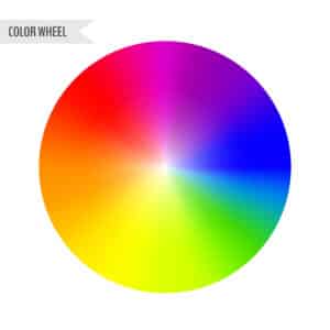
To pick the best colors every time, graphic designers use a color wheel. Colors are grouped into three categories: primary colors, secondary colors, and tertiary colors.
Color wheel basics
The first color wheel came to us from Sir Isaac Newton in 1666 and since, designers and artists alike have used it to develop color harmonies and interactions.
The primary colors include red, yellow, and blue. Secondary colors are then formed when primary colors are mixed and include green, orange, and purple. Tertiary colors made from primary and secondary colors include blue-green or red-violet.
The color wheel can also be divided in half to separate warm colors (red, orange, and yellow) from cool colors (blue, green, and purple). Warm colors can be associated with action while cool colors can be tied to peace and serenity. Temperature can affect the impact of your message when designing a logo, website, or other marketing materials.

Psychology and color theory
Color psychology is an important part of color theory. Designers have a visual goal but should also have an emotional goal for the end result.
Color represents a psychological influence on the brain. Different colors can represent different meanings for each person who experiences it. While color may not mean the same thing to every person, there are basic guidelines for the emotions they convey. Let’s talk about a few colors.
Red
The color red can increase a person’s pulse or metabolism. It can grab attention easily while highlighting important information. Use it to describe love, passion, or danger. It’s a vibrant choice for excitement and drama.
Yellow
Yellow is a great color for warmth and happiness. Use it to capture attention quickly or from long distances. A cheerful and energetic color, yellow inspires enthusiasm and confidence in a product. Overall this is a happy color.
Blue
Blue calls to mind feelings of stability and reliability. Viewers may feel calm and relaxed from its use. Businesses that want to project an image of security often use blue in their marketing efforts. Be careful because blue can also seem icy or distant.
Orange
Looking for high energy? Consider using orange. Orange calls to mind feelings of enthusiasm and excitement. It’s a high energy color and many sports teams use orange in their branding. Because it’s a bright color, many people feel warmth and enthusiasm from it.
Green
Green is connected to nature and money. Things like growth, fertility, and health come to mind when green is used. Some describe green as refreshing and tranquil, but don’t forget that it also can represent envy.
Purple
Purple is a royal color associated with nobility, wealth, power, and ambition. It combines the calm of blue and the fierce energy of the red it’s mixed with. Use purple to lift spirits or calm the mind and nerves.
White
White is a clean color often associated with health and innocence. It can be used to convey simplicity or product safety. White space can create breathing room between two or more elements.
Black
Black is the absorption of all colors. While it’s not on the color wheel there is some psychology behind it. Use black if you want to convey sophistication, authority, formality, power, or even anger. Be cautious because it can also evoke strong feelings of fear or sadness.
Some other basics
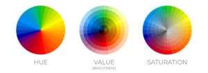
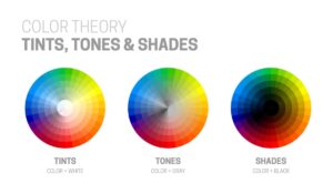
The color wheel allows you to create brighter, softer, darker, and lighter colors by mixing gray, black, and white with the original colors. These mixes create color variants as follows:
Hue: All the primary and secondary colors are hues in the color wheel. Many people try to use the words hue and color interchangeably, but technically they are different. A color is a general term whereas a hue refers to the dominant color family of a specific color we’re looking at. White, black, and grey are never referred to as a hue.

Shade: Shade is a common term for dark and light versions of the hue. Technically, it is the color you get when you add black to the given hue. For example, red + black = burgundy.
Tone: Tone is also known as saturation, where you can add black and white (or grey) to a color to generate a tone. Saturation is often used to create digital images.
Tint: A tint is just the opposite term of shade. Here, you need to add white to the color so that the resulting color can have a range of shades and tints. For example, red + white = pink.

Color schemes
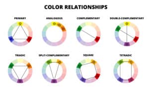
Strategically place colors in your images to optimize the user experience. Color schemes are logical combinations of colors on the color wheel. The purpose of a color scheme is to create an aesthetic feeling of style and appeal. Let’s take a look at all the schemes available.
Monochromatic
A monochromatic color scheme is when a single color is used with varying tints and shades to generate consistency. With this scheme your design will lack color contrast and will look clean and well-polished.
Analogous
An analogous color scheme is when one color is paired with the two adjacent colors on the color wheel. A little less contrasty, your softer designs will thank you. Understand that smaller touches of this color scheme with neutral colors as a base can go a long way.
Complementary
Use two colors opposite each other on the color wheel and you’ve got a complementary color scheme. This provides high color contrast in your designs. Great for graphs and charts, the contrast allows you to highlight important points.
Triadic
Triadic color schemes retain the same tone of the color while offering high-contrast color. It is created by using three colors placed equally in lines across the color wheel.

In conclusion
Color matters in your marketing endeavors. It plays a pivotal role in our visual experience. Did you know that people put more importance on visual factors while purchasing a product?
Subconscious judgements are often made within seconds of seeing your marketing materials, so make them stand out with color theory. Your colors will help the viewer process the message and store the experience in their memories. A picture is worth a thousand words and if you use the right colors then it’s worth so much more.
If you’re struggling with what colors will make an impact, come see or talk to our experts. We’ve created logos, magazine ads, newspaper ads, signs for the highway, signs for the lobby, electronic ads, brochures, flyers, digital ads, and so much more. If you can look at it, we can design it. We’ll start from the ground up or wipe the slate clean to create anything you can imagine. Our design team is ready to create the ‘just right’ look that represents your business perfectly!


